


A better reflection of the company we’ve become
Sorry, you haven’t heard from us in a while. We’ve spent the last 6 months beavering away at one of our biggest projects to date – our new brand and website ????
For the past four years, our little mascot (Giffy) and our simple communication style have done us proud. We’ve grown from 0 to over 350 clients and although it would be wrong to appropriate this solely to our image, we’re lucky enough to have attracted the attention of some truly amazing companies so far.
So if it’s not broke, why fix it?
With a new brand and more transparent comms’ we hope to help our clients and prospects get to know who we are and what we stand for.
In today’s marketplace, B2B buyers don’t need to just work with companies that solve their functional problems, they have the choice to work with companies that share their beliefs and principles.
By building a stronger brand platform, we’re hoping to help our clients and our prospects see beyond what we do and start truly getting to know us – the real us, to see the work we do behind the scenes, and ultimately better understand how we can help them succeed as a partner, not just a supplier.
So with a small tear of joy and the faint bang of a tiny drumroll, here it is, our new identity, our new website and the beginnings of our new brand.
We can’t wait to share it with you…
Meet the new Giffy
Yep, our little hummingbird logo has a name. We’re not sure where it originated but we (and our clients) have grown fond of him over the years.
Unlike a lot of logos, Giffy isn’t a literal representation of what we do, he’s a symbolic one and although we chose a hummingbird to communicate our agility as a startup, we felt he was just as relevant today. He just needed to grow up by five years.
Don’t get us wrong. We didn’t just keep him because we like him. The new Giffy had to hit a number of important criteria if he was going to make the cut…
- He had to have an air of sophistication without looking luxurious.
- He had to look creative, dynamic and smart.
- He had to work with our new design language (more on that below).
- He had to represent our forward momentum and focus.
- We’re a friendly bunch so ideally, he’d still be kinda cute!
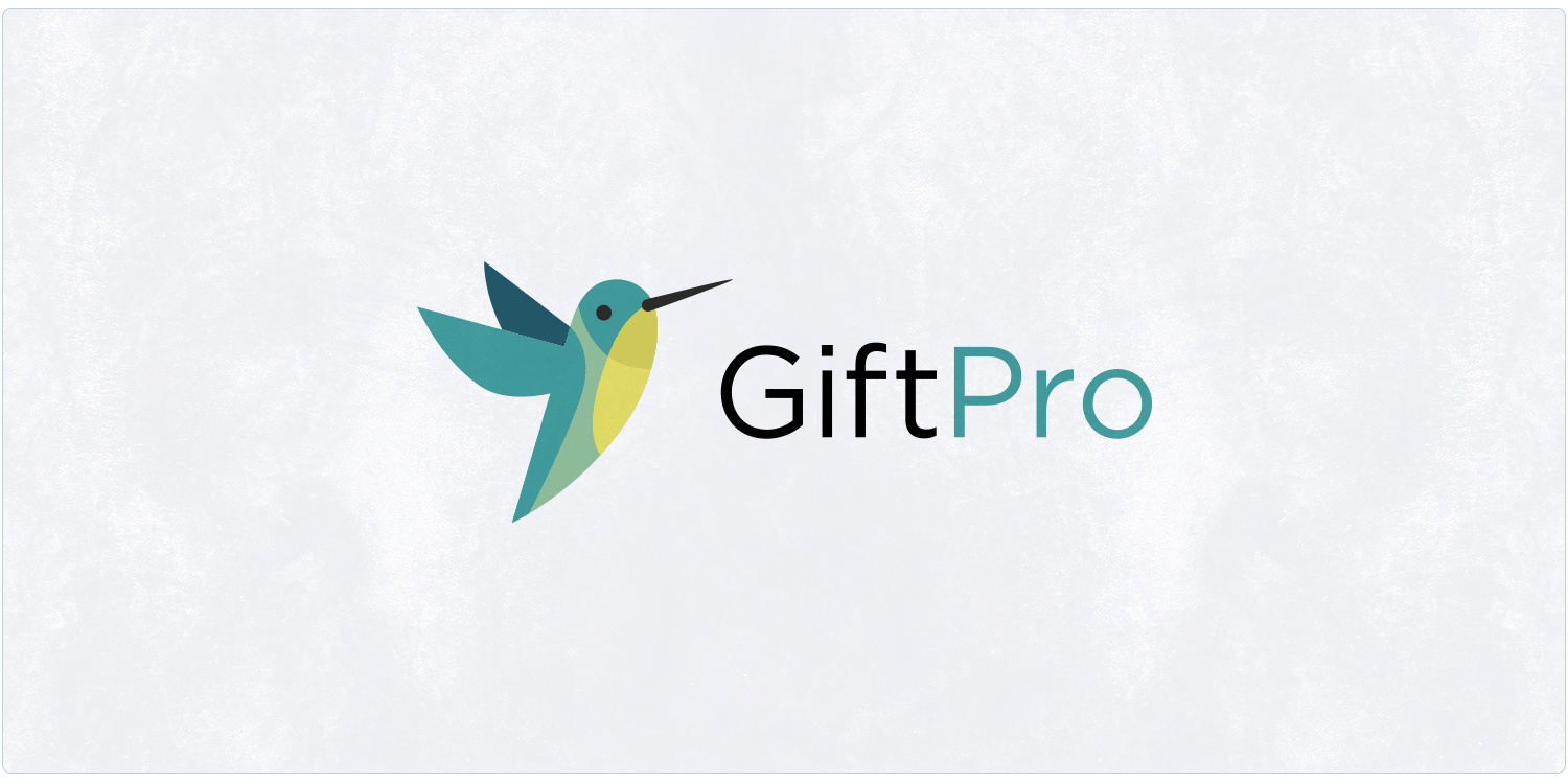
It’s not GiftPro, it’s Giftpro
Aside from looking like two words jammed together, we felt giving so much emphasis to the word Pro didn’t make sense anymore. It felt uncomfortable to read and always presented issues when designing marketing assets.
It’s not for us to say “We’re a brand name now” but we’d be lying if we didn’t aspire to be one, so by dropping the big P to a little p we feel we’ve not only made our logo more versatile and aesthetically pleasing but we’ve also moved our identity a step closer towards being a word-mark that truly feels like it’s ours.
Extending our brand beyond its logo
A great logo needs to be supported by a design language that extends the story, helps to shape initial perceptions and work as a canvas/platform for future communications.
In our case, that presented a few challenges…
Challenge 1
We’re a ‘white-label’ product but we wanted to use the new website as an opportunity to showcase our fantastic client base. The challenge was to design a creative extension that could complement our clients’ content without clashing, but also stand on its own two feet.
Challenge 2
Secondly, we’re a software provider, and although our admin area looks pretty slick (if we may say so) our design language had to be strong enough to lift lots of white and grey screenshots – the complete opposite to problem 1!
To top off our list of challenges we had a number of other criteria…
- Gift vouchers are very tactile objects. We wanted to buck the ‘flat’ trend and try to build texture and tactility into our design language.
- We obsess over the small things, so subtly communicating ‘attention to detail’ and ‘we’re geeks’ without necessarily saying it, felt important.
- We wanted to respect our original colours and maintain some legacy recognition whilst also adding energy and creative flexibility with a new palette.
Our new design language
After a ton of experimentation, we settled on a complementary colour palette that gave us light shades to act as a background canvas for our clients’ content, and rich shades to add vibrancy, and communicate our energy as a company.
Our clients trust us to handle valuable revenue streams for their business so we introduced the obligatory ‘corporate blue’ to create extra contrast, communicate trust and represent our more formal side.
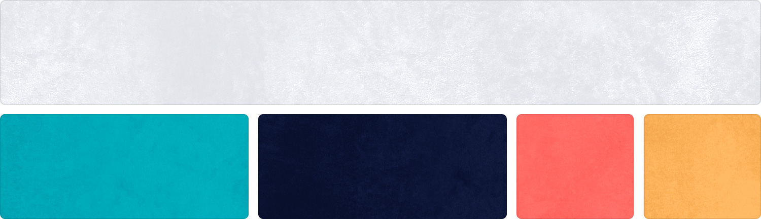
We’re a company full of creative people, even our developers think creatively, so it was really important to express this energy through our new colours and design elements.
We’re very serious about our work but we’re really easy-going people, so rather than going for a hard, angular ‘tech’ look we’ve opted for soft, natural shapes that are more harmonious to look at.

We also designed clearer icons with an offset print style as a nod to the physical printing methods our clients use when printing their packaging.
The power of people
Most SaaS companies look to automate support, but we’ve always been big on real relationships. We know that doesn’t scale as easily, but we genuinely don’t care. If access to human expertise helps our clients achieve better results then we’re going to keep doing it.
With that in mind, we wanted to start celebrating our amazing people. Giftpro wouldn’t be the company it is today without them and we thought it would be nice for our clients to see some of the people they deal with on a daily basis.

Illustration in moderation
We’ve always believed in the power of illustration, especially when used to extend the message behind a piece of written content.
Like the rest of our re-brand, ours were drawn in house by Rich (Using ProCreate) and they’ve been sprinkled throughout the site to add a little joy and add breathing room to written copy.

A website that’s designed to be helpful
Our new website is the first expression of our re-brand so it was an exciting opportunity to open the curtains and reveal so much more about ourselves and our wonderful clients. You’re on it right now, but here are a few of our favourite new pages…
- We wanted to make it easier to understand what’s included with our product, so we’ve broken it down into 4 core value propositions. Online store, Admin area, Fulfilment, and Support.
- Since launching it about a year ago our API is now used by some of the top ePOS providers and hospitality marketplaces. We wanted to draw attention to the flexibility this offers and highlight some of the things you can do.
- We’re obsessed with making sure Giftpro is the best system on the market so we felt it was sensible to add a Why us page that explains who we are, why we’re different and goes beyond what we do.
- Our website should be as much a tool as it is a marketing asset so we’ve launched a new help centre (and a few other handy features for logged-in clients). Expect to see lots of new user guides and handy tips over the next few months.
- Around 50% of our clients are upgrading to Giftpro from another platform so we’ve added a handy switch page to help alleviate concerns over switching gift voucher systems.
We’re really proud of our new image, but beneath it all, we’re still the same Giftpro – lead by design, driven by results and absolutely committed to helping our clients grow their revenues.
????Thanks for reading ????Here’s to the next chapter!

